
Reimagining Value for Verizon — A Multi-Brand Design System
Overview
As part of Verizon Value's portfolio transformation, I helped design a white-label design system that became the foundation for three best-in-class brand experiences — Total Wireless, Straight Talk, and Simple Mobile. My focus was on defining a component architecture that could carry a single, high-quality experience across brands while still letting each one look and feel distinctly itself.
Challenge
Verizon Value's brands were fragmented and under-performing. Each one had its own patterns, its own tech debt, and its own version of the same core flows, which made every improvement expensive and every launch slow.
Two problems sat underneath that fragmentation:
Value perception — customers equated low price with low quality, and inconsistent digital experiences reinforced that belief
Churn and satisfaction — NPS trailed leading brands, and friction in shopping and checkout was a contributing factor
The real issue wasn't any single page. It was that three brands were solving the same problems three separate times, and none of them well.
Solution
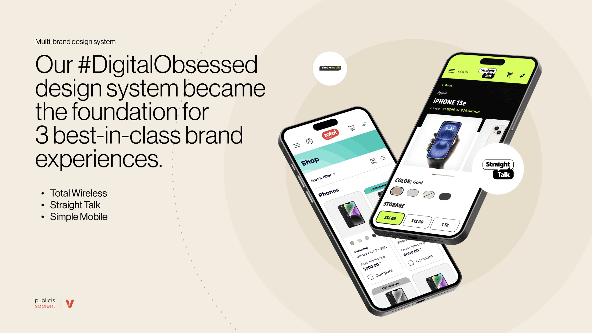
Rather than redesigning each brand individually, we reframed the problem as "how might we build one experience that can wear any brand."
We built a scalable white-label design system where components served as a single source of truth — shared layout, interaction, and behavior — with visual identity (color, spacing, typography) applied through appearance settings rather than branching or duplication. One component, any brand.
We then applied the system across the highest-leverage moments in the purchase journey:
Product listing page — standardized product cards optimized for fast scanning, with offers infused directly into the grid
Product detail page — unified device, plan, and offer selection into a single decision flow, using progressive disclosure to manage complexity while pricing and CTAs stayed anchored
Plan listing page — a global plan card structure that still absorbed brand-specific pricing, promos, and legal nuance
Cart and checkout — progressive disclosure of each step, with a clear breakdown of items, costs, and discounts
CAI agent — on-demand contextual support that reduced uncertainty at the moments where users were most likely to stall
The principle throughout was that consistency should be structural, not visual. Brands could differentiate on expression; they shouldn't have to differentiate on whether checkout works well.
Impact
The system shipped across all three brands and moved both customer and operational metrics:
Add-to-cart +75%
Order conversion +23%
Total orders +13.21%
Speed to market +25–50% in operational efficiency
At the page level, the device gridwall engagement rate rose 539 bps and cart conversion rose 872 bps versus BAU, with add-to-cart on the PDP up 14.3%.
My Role
I worked as a UX lead and interaction designer across the system and its application, partnering with product, brand, and engineering to:
Define the component architecture and the line between shared behavior and brand expression
Design the core commerce flows — PLP, PDP, plan listing, and cart and checkout
Resolve trade-offs where brand-specific pricing, promos, and legal requirements met a shared structure
Produce documentation that let three brand teams adopt and extend the system without forking it

